
|
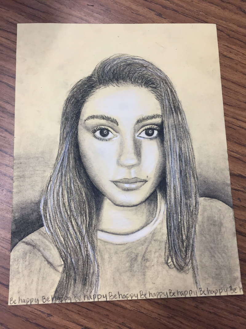
Charcoal self portraitMy drawing is a portrait of myself in charcoal. I created value in the portrait with the gradient in the back, but struggled with creating texture in my hair. The big idea behind the text and it's placement in my drawing is that my bottom line is to be happy. In my drawing I started trying to lay everything out and didn't change much in comparison to my original picture. I decided to change my shirt to make it more simple because it was tie dye before and I decided it wouldn't translate well. I also decided to not include any background and add the gradient by my shoulders to emphasize them. My goals are to be able to make a drawing like this as realistic as possible, which i struggled with in the drawing. If I were to redo my drawing, I would try to do my proportions a little better and focus more detail on my shirt. This piece helped my become more comfortable with charcoal and learn the importance of proportions.
Maroon BellsMy artwork is a drawing of the Maroon Bells, and is based off a picture I took in Aspen. It includes not only the Maroon Bells but also the surrounding hillsides and lake below. I created the work by first laying down pastels as the base colors. Starting in the background, I created the sky and clouds. I filled in the mountains with blue and the hills with different tones of green. I struggled in the lake, and opted to add mix of color that would reflect the landscape. I added detail with colored pencil, creating texture in the mountains and trees in the hills. I was inspired by the natural beauty of the Maroon Bells area that struck me when I visited. My goal with the artwork was to make it as close to the original image as possible. I don't think I completely achieved that as some areas look muddy. I should've added more layers, detail, and vibrant color. Although it didn't turn out exactly as I hoped, this piece helped me become more familiar with what techniques work well with pastel and colored pencil.
|
|
Color Theory Project
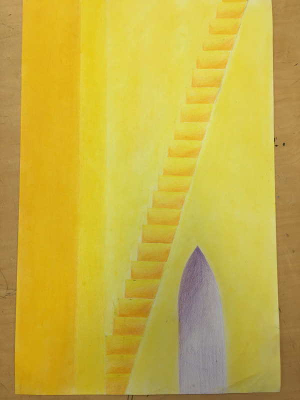
This drawing (done in colored pencil), depicts a staircase with a doorway. The color scheme is intentionally only yellow and purple, which are complementary colors. I created this drawing my layering colored pencil to create gradients in the stairs and doorway. My art is simple and clean, and meant to display the contrast of the colors. The clean lines are meant to be visually and aesthetically pleasing, and the plainness of the image is quite calming. My goal was to be able to portray those clean lines while creating vivid colors within the work. Although I think the lines and gradients look good in this drawing, they could most definitely be improved upon. Overall, I like what I have accomplished in this work, but still see room for improvement and opportunity to make it more interesting.
|
|
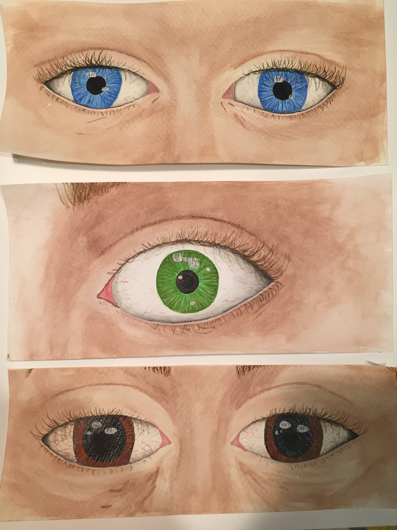
Eyes (Content, Fearful, Drowsy)My three eyes depict 3 different emotions (contentment, fear, and drowsiness). I used 3 different eye colors for this project, each eye color contributing to the emotion of the eye(s). I used watercolor for these paintings. I created them by laying down base colors for the skin, shaping out the surrounding area by concentrating pigment in some areas. I colored the pupils by layering shades of the color of the eye. I created dimension in the eye by making a gradient around the outside of the whites of the eye. Through this, I attempted to create the effect of a spherical eyeball. I filled in the eyelashes, and added black to the centers of the pupils. I layered on spots of white to create a reflection, and faintly painted in eyelashes on the white of the eye to convey a shadow. For fear and drowsiness, I painted in eyebrows but decided to keep them out of contentment because I liked the alien effect it had. I wanted to focus the contentment on the emotion in the eyes, not how normal the area looked. For fear, the widened eye shows shock, and the vividness of the green is a punch of color that goes along with the emotion. For drowsiness, the large eyes, dilated pupils, and red veins capture a tired and burnt-out feeling. My goals were to accurately portray an eye, as well as become more familiar with mixing and applying watercolor. Overall, I feel as though I achieved my goals and like the way my eyes turned out. Next time, I would spend more time mapping out my eyes so my proportions turn out better
|
Zentangle Project

My zentangle project depicts several planets in a messy and complex world. The more simple and quiet planets are surrounded by a series of patterns swirling around. I created my artwork by taping off the planets and laying down a multicolored watercolor background for the "space". I filled that in using black pen, creating swirls and filling them with a variety of patterns. I then taped around the planets and filled those in with watercolors, using lots of water to create a more diffused look, avoiding harsh textures. The main idea behind my artwork is to express the complexity and chaos of the universe, and to also express the serenity on a smaller scale (the planets). In universe full of confusing thoughts and ideas, we can always rely on the natural beauty of the world to calm us. My main goal of this project was to fill the sky area with enough patterns to make it look like dark space, but to keep it light enough to maintain those patterns. This was achieved more in some areas than other, but overall I think it looks pretty good. Overall, I like the piece and think my slightly ambitious ideas (as far as filling out so much space) paid off. I developed my watercolor skills, and became more familiar with how the watercolor, pen, and tape all work together.
Tempera Batik Project

|
Why:
1. Adding three layers of the tempera paint relates to life because although it may be tedious to do, and looks fine without all those layers (before the ink), it is important to build up that resilience in life, because it can help you retain character. 2. Covering the painting with ink relates to life because its a really scary thing to cover up your hard work, but in the end you just have to take that risk. You have to trust that your resilience will hold up. 3. Washing off the black relates to life because even though the entire painting can be covered in darkness, all the time and effort you put into it allows it to survive and the darkness only adds to the painting in the end. |
My artwork depicts sunflowers and their leaves against a deep blue sky. It was created by drawing down sharpie for the black lines, putting down 3 layers of tempera paint around these lines, and then covering the whole painting in black ink and washing. This left a dark texture on the painting. The yellow sunflowers present a happy and optimistic element in the painting, which contrasts with the deep colors and black ink. My goals for this artwork was for an even distribution of texture, deep blacks, and for the color to hold up. Some of the texture is a little patchy, and the color did fade in some areas, which was disappointing. However, I am really happy with the flower petals, which I hoped would be the highlight of the piece. Overall, I liked this artwork, and I really enjoyed making the flowers and will be sure to incorporate them again because I love how happy they are. The technique was really fun and looks good, and I like how it deepened the whole painting.
Printmaking Project
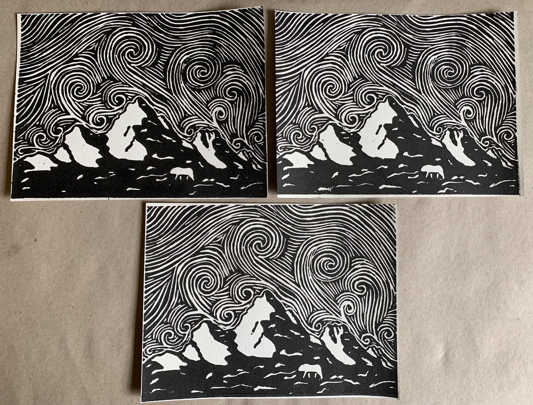
These are my three non-salty prints of a mountain scene with a swirly sky. The print depicts rocky mountains with a small animal, and a windy sky. To create these pieces, I carved the scene in a linoleum print and printed on watercolor paper with block printing ink. I printed roughly 20 pieces to get the three non-salty prints. I decided to carve a mountain because I really love the mountains, and I was inspired by swirly skies like in The Starry Night for the sky. I also decided to include the bear because my original print (which cracked and didn't work out) was of a bear, so I wanted to keep that in my new attempt. My goals were mainly to create a plate that printed for this project, which I did. Overall, I think it looks pretty good, and these prints turned out well. Printing this was very challenging however, and took some practice. Also, the bear doesn't really look like a bear, but I was unable to fix it after it had been carved.
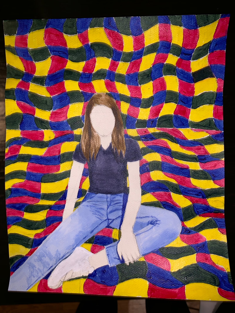
Missing Pieces Project
|
This is my missing pieces project. The image depicts me, with my skin and face missing, sitting in a colorful room. I created this painting using acrylic paint on watercolor paper. I decided to make the "missing pieces" be me in order to showcase the crazy and confusing colors around me, as if that is what I'm feeling. My goals were to develop my skills working with acrylic paint and create accurate depth with the colors. I messed up plenty of times with this acrylic paint, but I've found ways to work with it. Additionally, I messed up lots of times on the background, and the painting is not my favorite, but I worked with my mistakes. So, I like the idea behind this art, but I don't love the execution.
|
